Sustainable Color Palettes and Textures: Design That Breathes With the Earth
Chosen theme: Sustainable Color Palettes and Textures. Step into a world where every hue has a conscience and every texture tells a regenerative story. Explore planet-friendly pigments, tactile materials, and real-life tips that help your spaces feel beautiful, ethical, and alive. Join our community—comment, subscribe, and shape the next chapter of sustainable design together.
Color Psychology Meets Sustainability
Low-impact hues that calm without compromise
Soft mineral greens, clay beiges, and foggy blues derived from earth pigments and algae-based inks can lower stress without off-gassing harsh chemicals. Choose paints with verified low VOCs and recycled content to keep your sanctuary breathable.
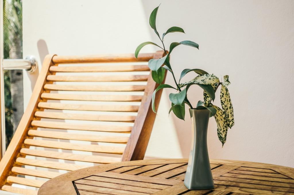
Warmth through waste-smart neutrals
Neutral schemes feel richer when the texture carries the warmth: limewash walls, reclaimed wood grains, and jute weaves. These choices reduce demand for virgin resources while wrapping rooms in a tactile, human comfort you can actually feel.
Share your mindful color story
Have you swapped a glossy synthetic paint for a mineral lime finish and noticed better sleep or fewer headaches? Tell us in the comments, and subscribe for monthly palette recipes aligned with health and habitat.
Onion skins, avocado pits, and black tea yield ochres, blushes, and smoky browns with remarkable depth. Use stainless pots, experiment with fabric scraps, and keep notes; natural color rewards patience, curiosity, and careful observation.
Textures With Purpose: Renewable Materials That Tell Stories
Hemp upholstery breathes, cork floors cushion footsteps, and kenaf panels dampen echo while adding organic depth. These materials regenerate quickly, store carbon, and create a quiet, grounded backdrop for thoughtful color palettes.
Textures With Purpose: Renewable Materials That Tell Stories
Lime plaster develops a velvety sheen with time, and beeswax-finished wood deepens in tone naturally. Embrace wear as a design feature; patina celebrates life lived, reducing the urge to replace surfaces prematurely.
The team began by listing every coating, adhesive, and textile in use, then mapped VOC ratings and end-of-life paths. That clarity revealed quick wins—like ditching solvent primers for mineral alternatives without sacrificing coverage.
Case Study: A Studio’s Palette Pivot to Sustainability
They moved to limewash walls, cork underlay, undyed wool rugs, and casework finished with plant oils. Clients reported fresher air and calmer spaces, while photos captured nuanced color depth impossible with plastic-heavy paints.
Case Study: A Studio’s Palette Pivot to Sustainability
Building a Sustainable Mood Board
Label each color with pigment source, binder type, VOC rating, and certifications. For textiles, note fiber origin and dye method. The details anchor beauty in accountability and make approvals swift and confident.
Building a Sustainable Mood Board
Add macro photos of cork pores, linen slubs, and limewash movement. Include rubbings or peel-and-stick samples. This tactile evidence brings the palette alive and prevents surprises once the materials land on site.
Care, Longevity, and Afterlife
Skip harsh solvents. Use diluted vinegar for mineral surfaces, castile soap for plant-oil finishes, and soft brushes for textiles. Gentle care keeps hues vibrant while protecting the microbiome of your home.
Care, Longevity, and Afterlife
Choose reversible adhesives, mechanical fasteners, and modular formats. When parts can be separated, colors and textures live a second life instead of heading to landfill, extending both beauty and responsibility.